The sticky post should be distinctly recognizable in some way in comparison to normal posts. You can style the .sticky class if you are using the post_class() function to generate your post classes, which is a best practice.
They should show at the very top of the blog index page, even though they could be several posts back chronologically.
They should still show up again in their chronologically correct postion in time, but without the sticky indicator.
If you have a plugin or widget that lists popular posts or comments, make sure that this sticky post is not always at the top of those lists unless it really is popular.
Donec id elit non mi porta gravida at eget metus. Cum sociis natoque penatibus et magnis dis parturient montes, nascetur ridiculus mus. Donec ullamcorper nulla non metus auctor fringilla.
Heading One
Heading Two
Heading Three
Heading Four
Heading Five
Heading Six
Preformatted Block
The Road Not Taken, by Robert Frost

Two roads diverged in a yellow wood,
And sorry I could not travel both
And be one traveler, long I stood
And looked down one as far as I could
To where it bent in the undergrowth;
Then took the other, as just as fair,
And having perhaps the better claim,
Because it was grassy and wanted wear;
Though as for that the passing there
Had worn them really about the same,
And both that morning equally lay
In leaves no step had trodden black.
Oh, I kept the first for another day!
Yet knowing how way leads on to way,
I doubted if I should ever come back.
I shall be telling this with a sigh
Somewhere ages and ages hence:
Two roads diverged in a wood, and I—
I took the one less traveled by,
And that has made all the difference.

...and heres a line of some really, really, really, really long text, just to see how it is handled and to find out how it overflows;
Ordered List
Nullam id dolor id nibh ultricies vehicula ut id elit.
Donec ullamcorper nulla non metus auctor fringilla.
Condimentum euismod aenean.
Purus commodo ridiculus.
Nibh commodo vestibulum.
Cras justo odio, dapibus ac facilisis in.
Unordered List
Nullam id dolor id nibh ultricies vehicula ut id elit.
Donec ullamcorper nulla non metus auctor fringilla.
Nibh commodo vestibulum.
Aenean eu leo quam.
Pellentesque ornare sem lacinia.
Cras justo odio, dapibus ac facilisis in.
Verse
This is an example of the core Gutenberg verse block.
A block for haiku?
Why not?
Blocks for all the things!
Separator
Here are examples of the three separator styles of the core Gutenberg separator block.
Table
Here is an example of the core Gutenberg table block.
Employee
Salary
Position
Jane Doe
$100k
CEO
John Doe
$100k
CTO
Jane Bloggs
$100k
Engineering
Fred Bloggs
$100k
Marketing
Latest Posts, List View
Praesent commodo cursus magna, vel scelerisque nisl consectetur et. Cras justo odio, dapibus ac facilisis in, egestas eget quam.
Latest Posts, Grid View
And now for the Grid View. The Latest Posts block also displays at wide and full width alignments, so be sure to check those styles as well.
Blockquote
Nulla vitae elit libero, a pharetra augue. Morbi leo risus, porta ac consectetur ac, vestibulum at eros. Maecenas sed diam eget risus varius blandit sit amet non magna sed diam ed diam eget risus varius eget.
Donec sed odio dui. Maecenas faucibus mollis interdum. Duis mollis, est non commodo luctus, nisi erat porttitor ligula, eget lacinia odio.
Rich Tabor
Nulla vitae elit libero, a pharetra augue. Morbi leo risus, porta ac consectetur ac, vestibulum at eros. Maecenas sed diam eget risus varius blandit sit amet non magna sed diam ed diam eget risus varius eget.
Alternate Blockquote
The alternate block quote style can be tarageted using the .wp-block-quote.is-large. CSS selector. Nulla vitae elit libero, a pharetra augue. Morbi leo risus, porta ac consectetur ac, vestibulum at eros.
Donec sed odio dui. Maecenas faucibus mollis interdum. Duis mollis, est non commodo luctus, nisi erat porttitor ligula, eget lacinia odio sem nec elit.
Rich Tabor
Nulla vitae elit libero, a pharetra augue. Morbi leo risus, porta ac consectetur ac, vestibulum at eros. Maecenas sed diam eget risus varius blandit sit amet non magna sed diam ed diam eget risus varius eget.
Audio
Donec sed odio dui. Aenean lacinia bibendum nulla sed consectetur. Nullam id dolor id nibh ultricies vehicula ut id elit. Center aligned:An example of an Audio Block caption
Curabitur blandit tempus porttitor. Donec sed odio dui. Etiam porta sem malesuada magna mollis euismod. Curabitur blandit tempus porttitor.
Buttons
Donec sed odio dui. Aenean lacinia bibendum nulla sed consectetur. Nullam id dolor id nibh ultricies vehicula ut id elit. Center aligned: Center Aligned Button
Vivamus sagittis lacus vel augue laoreet rutrum faucibus dolor auctor. Integer posuere erat a ante venenatis dapibus posuere velit aliquet. Left Aligned Button
Vivamus sagittis lacus vel augue laoreet rutrum faucibus dolor auctor. Integer posuere erat a ante venenatis dapibus posuere velit aliquet. Donec ullamcorper nulla non metus auctor fringilla. Maecenas sed diam eget risus varius.Right Aligned Button
Vivamus sagittis lacus vel augue laoreet rutrum faucibus dolor auctor. Integer posuere erat a ante venenatis dapibus posuere velit aliquet. Donec ullamcorper nulla non metus auctor fringilla. Maecenas sed diam eget risus varius.
Categories
Archives
Columns
Fusce dapibus, tellus ac cursus commodo, tortor mauris condimentum nibh, ut fermentum massa justo sit amet risus. Aenean lacinia bibendum nulla sed consectetur. Aenean eu leo quam. Pellentesque ornare sem lacinia quam venenatis vestibulum. Donec ullamcorper nulla non metus auctor fringilla. Aenean eu leo quam. Pellentesque ornare sem lacinia quam venenatis vestibulum. Curabitur blandit tempus porttitor.
Fusce dapibus, tellus ac cursus commodo, tortor mauris condimentum nibh, ut fermentum massa justo sit amet risus. Aenean lacinia bibendum nulla sed consectetur. Aenean eu leo quam. Pellentesque ornare sem lacinia quam venenatis vestibulum. Donec ullamcorper nulla non metus auctor fringilla. Aenean eu leo quam. Pellentesque ornare sem lacinia quam venenatis vestibulum. Curabitur blandit tempus porttitor.
Fusce dapibus, tellus ac cursus commodo, tortor mauris condimentum nibh, ut fermentum massa justo sit amet risus. Aenean lacinia bibendum nulla sed consectetur. Aenean eu leo quam. Pellentesque ornare sem lacinia quam venenatis vestibulum.
Fusce dapibus, tellus ac cursus commodo, tortor mauris condimentum nibh, ut fermentum massa justo sit amet risus. Aenean lacinia bibendum nulla sed consectetur. Aenean eu leo quam. Pellentesque ornare sem lacinia quam venenatis vestibulum.
Fusce dapibus, tellus ac cursus commodo, tortor mauris condimentum nibh, ut fermentum massa justo sit amet risus. Aenean lacinia bibendum nulla sed consectetur. Aenean eu leo quam. Pellentesque ornare sem lacinia quam venenatis vestibulum.
Fusce dapibus, tellus ac cursus commodo, tortor mauris condim entum nibh.
Fusce dapibus, tellus ac cursus commodo, tortor mauris condim entum nibh.
Fusce dapibus, tellus ac cursus commodo, tortor mauris condim entum nibh.
Fusce dapibus, tellus ac cursus commodo, tortor mauris condim entum nibh.
Pull Quotes
Here is an example of the core pull quote block, set to display centered. Nulla vitae elit libero, a pharetra augue. Morbi leo risus, porta ac consectetur ac, vestibulum at eros.
Aenean eu leo quam. Pellentesque ornare sem lacinia quam venenatis vestibulum. Sed posuere est at lobortis.
Rich Tabor, ThemeBeans.com
Wide aligned
Here is an example of the core pull quote block, set to display with the wide-aligned attribute, if the theme allows it. Nulla vitae elit libero, a pharetra augue. Morbi leo risus, porta ac consectetur ac, vestibulum at eros.
Here we have a left-aligned pullquote.
Rich Tabor
Donec id elit non mi porta gravida at eget metus. Nullam quis risus eget urna mollis ornare vel eu leo. Cras justo odio, dapibus ac facilisis in, egestas eget quam. Integer posuere erat a ante venenatis dapibus posuere velit aliquet. Cras mattis consectetur purus sit amet fermentum. Vestibulum id ligula porta felis euismod semper.
Here we have a right-aligned pullquote.
Rich Tabor
Donec ullamcorper nulla non metus auctor fringilla. Aenean eu leo quam. Pellentesque ornare sem lacinia quam venenatis vestibulum. Cum sociis natoque penatibus et magnis dis parturient montes, nascetur ridiculus mus. Etiam porta sem malesuada magna mollis euismod. Morbi leo risus, porta ac consectetur ac, vestibulum at eros.
Image Block
Duis mollis, est non commodo luctus, nisi erat porttitor ligula, eget lacinia odio sem nec elit. Maecenas faucibus mollis interdum.
And an image with a caption
Fusce dapibus, tellus ac cursus commodo, tortor mauris condimentum nibh, ut fermentum massa justo sit amet risus. Duis mollis, est non commodo luctus, nisi erat porttitor ligula, eget lacinia odio sem nec elit.
Left aligned: dapibus, tellus ac cursus commodo, tortor mauris condimentum nibh, ut fermentum massa justo sit amet risus. Aenean eu leo quam. Pellentesque ornare sem lacinia quam venenatis vestibulum.
This one is captioned
Nullam quis risus eget urna mollis ornare vel eu leo. Praesent commodo cursus magna, vel scelerisque nisl consectetur et. Maecenas faucibus mollis interdum. Vestibulum id ligula porta felis euismod semper. Nullam quis risus.
Video Block
Lets check out the positioning and styling of the video core block. We will check the wide and full alignments too.
Cover Image Block
Check out the positioning and styling of the cover image core block. We will check the wide and full alignments, as well as left/right.
Left Aligned Cover Image
Left aligned: dapibus, tellus ac cursus commodo, tortor mauris condimentum nibh, ut fermentum massa justo sit amet risus. Aenean eu leo quam. Pellentesque ornare sem lacinia quam venenatis vestibulum. Etiam porta sem malesuada magna mollis euismod. Aenean lacinia bibendum nulla sed consectetur. Praesent commodo cursus magna, vel scelerisque nisl consectetur et.
Right Aligned Cover Image
Right aligned: scelerisque nisl consectetur et. Nulla vitae elit libero, a pharetra augue. Nullam id dolor id nibh ultricies vehicula ut id elit.
Fusce dapibus, tellus ac cursus commodo, tortor mauris condimentum nibh, ut fermentum massa justo sit amet risus. Nullam id dolor id nibh ultricies vehicula ut id elit. Vel scelerisque nisl consectetur et. Nulla vitae elit libero, a pharetra augue. Nullam id dolor id nibh ultricies vehicula ut id elit. Center aligned:
Center Aligned Cover Image
Gallery Blocks
Let us check out the positioning and styling of the gallery blocks.
Two Column Gallery
Below we have a Gallery Block inserted with two columns and two images.
Three Column
Below we have a Gallery Block inserted with three columns and three images.
Four Column
Below we have a Gallery Block inserted with four columns and four images.
Five Column
Below we have a Gallery Block inserted with five columns and five images.
Four Column, Five Images
Let us switch things up a bit. Now we have a Gallery Block inserted with four columns and five images.
Three Column, Five Images
Now we have a Gallery Block inserted with three columns and five images.
Below you will find a Gallery Block inserted with two columns and five images.
Two Column, Five Images
Three Column, Four Images
Below you will find a Gallery Block inserted with three columns and four images.
Welcome to image alignment! If you recognize this post, it is because these are blocks that have been converted from the classic Markup: Image Alignment post. The best way to demonstrate the ebb and flow of the various image positioning options is to nestle them snuggly among an ocean of words. Grab a paddle and let’s get started. Be sure to try it in RTL mode. Left should stay left and right should stay right for both reading directions.
On the topic of alignment, it should be noted that users can choose from the options of None, Left, Right, and Center. If the theme has added support for align wide, images can also be wide and full width. Be sure to test this page in RTL mode.
In addition, they also get the options of the image dimensions 25%, 50%, 75%, 100% or a set width and height.
The image above happens to be centered.
The rest of this paragraph is filler for the sake of seeing the text wrap around the 150×150 image, which is left aligned.
As you can see the should be some space above, below, and to the right of the image. The text should not be creeping on the image. Creeping is just not right. Images need breathing room too. Let them speak like you words. Let them do their jobs without any hassle from the text. In about one more sentence here, we’ll see that the text moves from the right of the image down below the image in seamless transition. Again, letting the do it’s thang. Mission accomplished!
And now for a massively large image. It also has no alignment.
The image above, though 1200px wide, should not overflow the content area. It should remain contained with no visible disruption to the flow of content.
And now we’re going to shift things to the right align. Again, there should be plenty of room above, below, and to the left of the image. Just look at him there… Hey guy! Way to rock that right side. I don’t care what the left aligned image says, you look great. Don’t let anyone else tell you differently.
In just a bit here, you should see the text start to wrap below the right aligned image and settle in nicely. There should still be plenty of room and everything should be sitting pretty. Yeah… Just like that. It never felt so good to be right.
And just when you thought we were done, we’re going to do them all over again with captions!
The image above happens to be centered. The caption also has a link in it, just to see if it does anything funky.
Itty-bitty caption.
The rest of this paragraph is filler for the sake of seeing the text wrap around the 150×150 image, which is left aligned.
As you can see the should be some space above, below, and to the right of the image. The text should not be creeping on the image. Creeping is just not right. Images need breathing room too. Let them speak like you words. Let them do their jobs without any hassle from the text. In about one more sentence here, we’ll see that the text moves from the right of the image down below the image in seamless transition. Again, letting the do it’s thang. Mission accomplished!
And now for a massively large image. It also has no alignment.
Massive image comment for your eyeballs.
The image above, though 1200px wide, should not overflow the content area. It should remain contained with no visible disruption to the flow of content.
Feels good to be right all the time.
And now we’re going to shift things to the right align. Again, there should be plenty of room above, below, and to the left of the image. Just look at him there… Hey guy! Way to rock that right side. I don’t care what the left aligned image says, you look great. Don’t let anyone else tell you differently.
In just a bit here, you should see the text start to wrap below the right aligned image and settle in nicely. There should still be plenty of room and everything should be sitting pretty. Yeah… Just like that. It never felt so good to be right.
Imagine that we would find a use for the extra wide image! This image has the wide width alignment:
Can we go bigger? This image has the full width alignment:
And that’s a wrap, yo! You survived the tumultuous waters of alignment. Image alignment achievement unlocked! One last thing: The last item in this post’s content is a thumbnail floated right. Make sure any elements after the content are clearing properly.
Maecenas suscipit, risus et eleifend imperdiet, nisi orci ullamcorper massa, et adipiscing orci velit quis magna. Praesent sit amet ligula id orci venenatis auctor. Phasellus porttitor, metus non tincidunt dapibus, orci pede pretium neque, sit amet adipiscing ipsum lectus et libero. Aenean bibendum. Curabitur mattis quam id urna.
Vivamus dui. Donec nonummy lacinia lorem. Cras risus arcu, sodales ac, ultrices ac, mollis quis, justo. Sed a libero. Quisque risus erat, posuere at, tristique non, lacinia quis, eros.
Gallery blocks have two settings: the number of columns, and whether or not images should be cropped. The default number of columns is three, and the maximum number of columns is eight.
Below is a three column gallery at full width, with cropped images.
Lorem ipsum dolor sit amet, consectetuer adipiscing elit. Donec mollis. Quisque convallis libero in sapien pharetra tincidunt. Aliquam elit ante, malesuada id, tempor eu, gravida id, odio. Maecenas suscipit, risus et eleifend imperdiet, nisi orci ullamcorper massa,
et adipiscing orci velit quis magna.
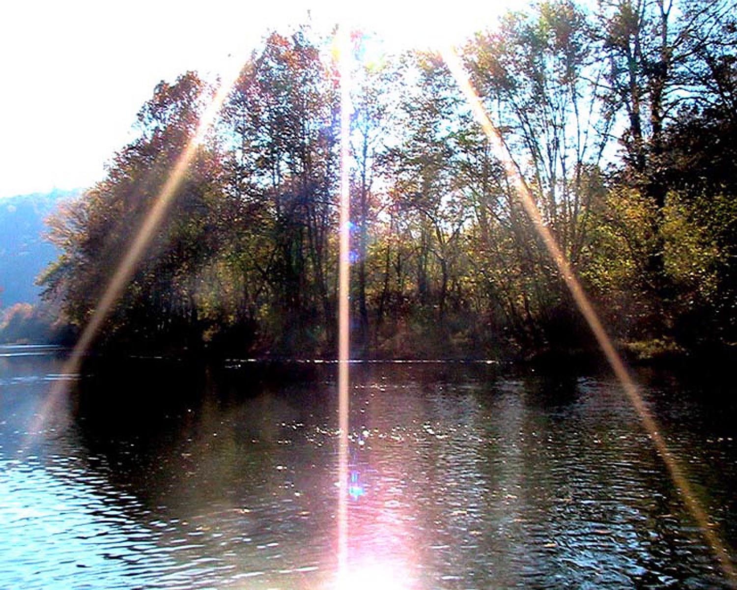
Sunburst over the Clinch River,
Southwest Virginia.
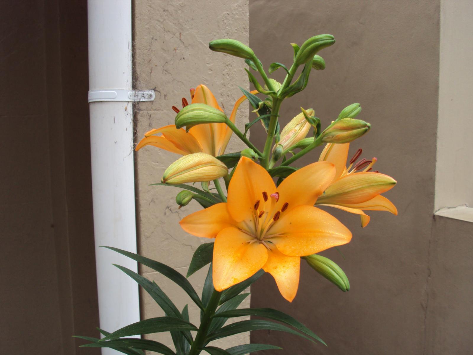
Orange Iris
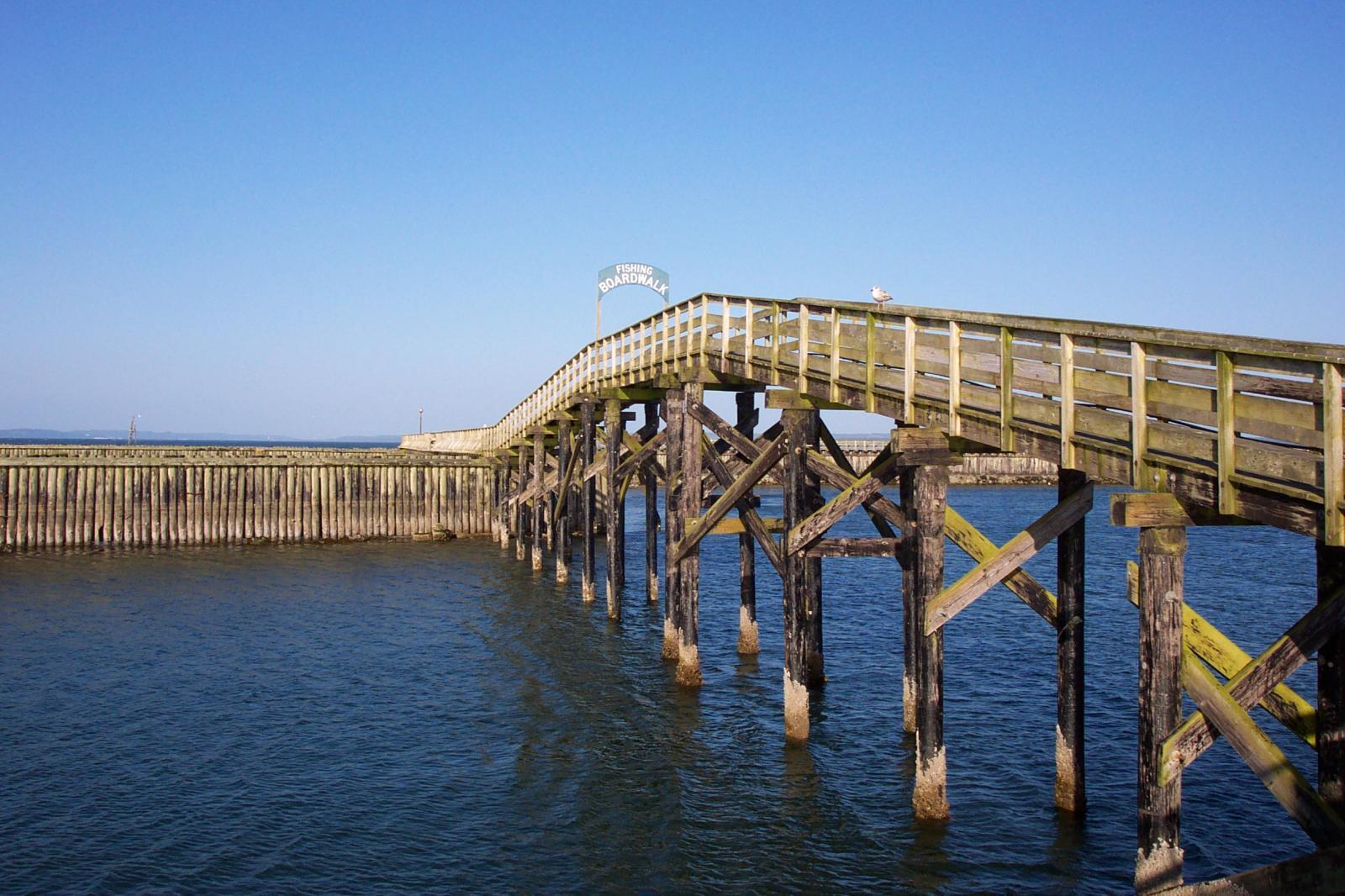
Boardwalk at Westport, WA
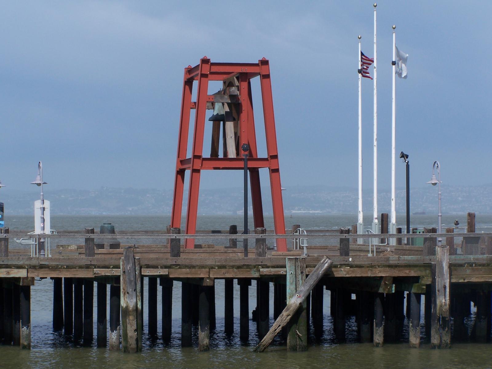
Bell on wharf in San
Francisco
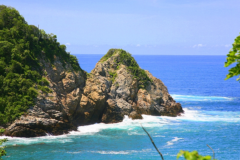
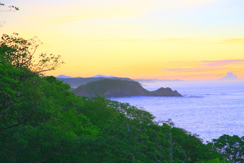
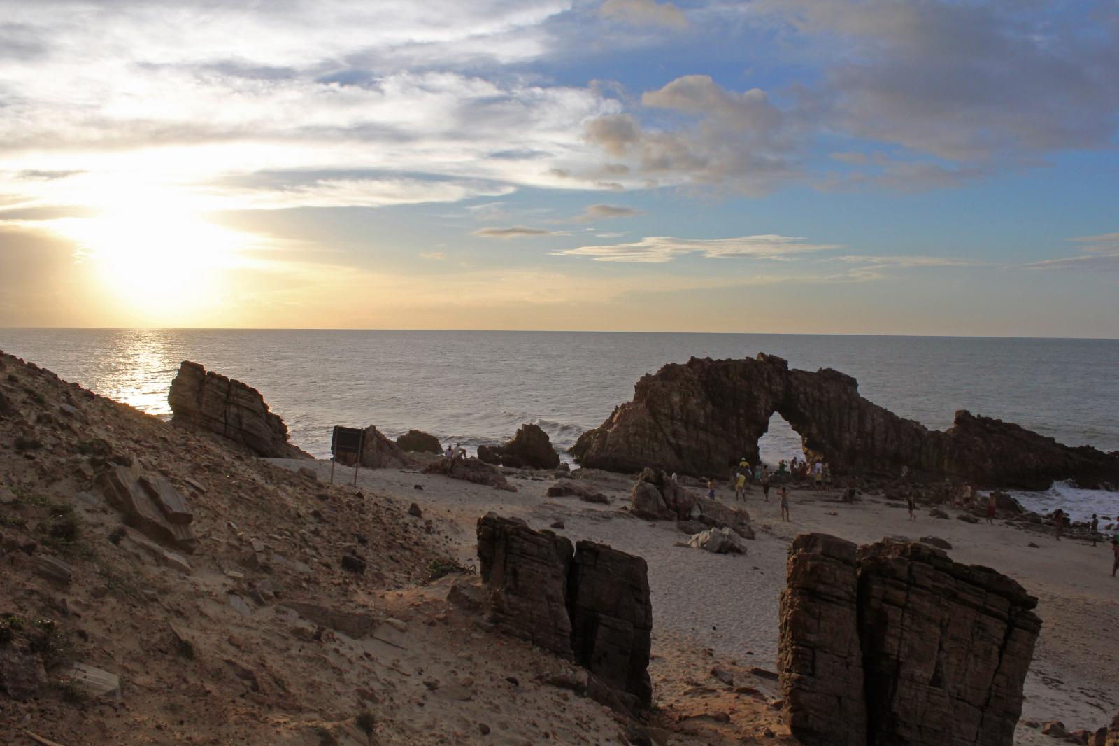
Coastline in Huatulco, Oaxaca, Mexico
(gallery caption) 3 column, full width, cropped, linked to attachment pages
Boat BW PB Barco Texture Beautiful Fishing
Some more text for taking up space.
A two column gallery, aligned to the left, linked to media file.
In the editor, the image captions can be edited directly by clicking on the text.
If the number of images cannot be divided into the number of columns you have selected, the default is to have the last image(s) automatically stretch to the width of your gallery.
A four column gallery with a wide width:
Sunrise over the coast in Huatulco, Oaxaca, Mexico
Lorem ipsum dolor sit amet, consectetuer adipiscing elit. Donec mollis. Quisque convallis libero in sapien pharetra tincidunt. Aliquam elit ante, malesuada id,
tempor eu, gravida id, odio. Maecenas suscipit, risus et eleifend imperdiet, nisi orci ullamcorper massa, et adipiscing orci velit quis magna.
A five column gallery with normal images:
This is the same gallery, but with cropped images.
Six columns: does it work at all window sizes?
Boardwalk at Westport, WA
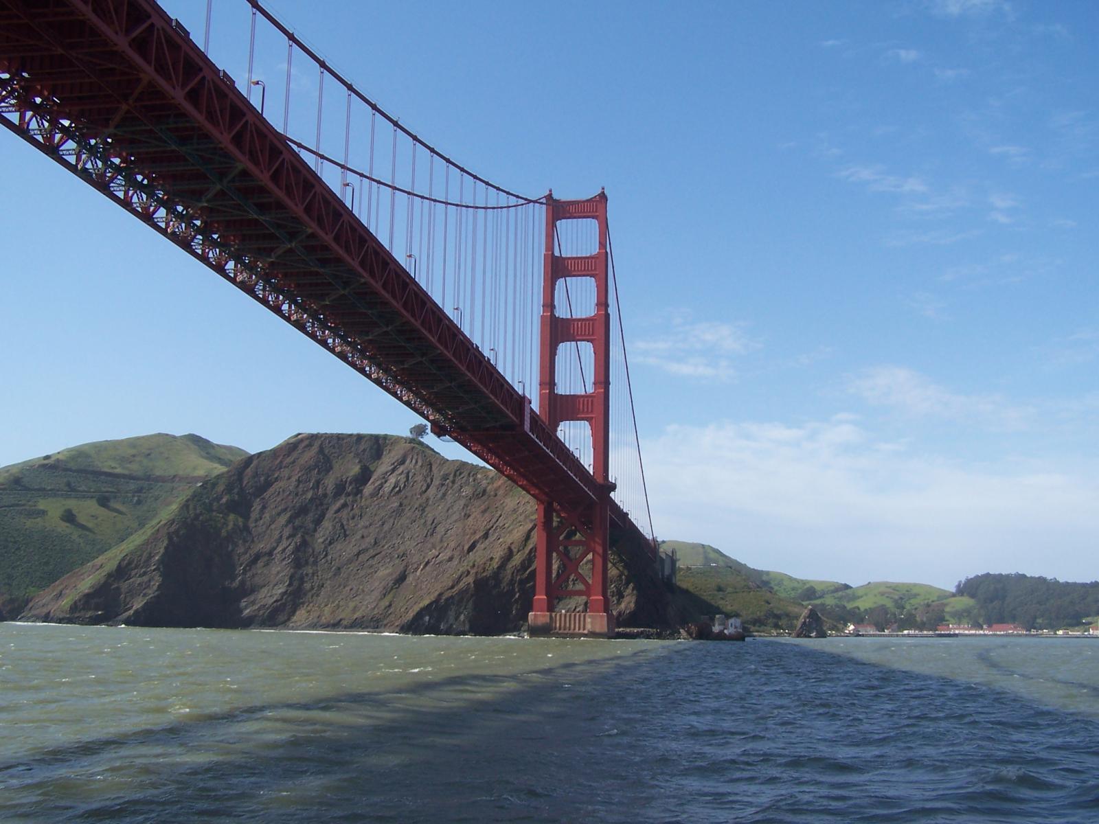
Golden Gate Bridge
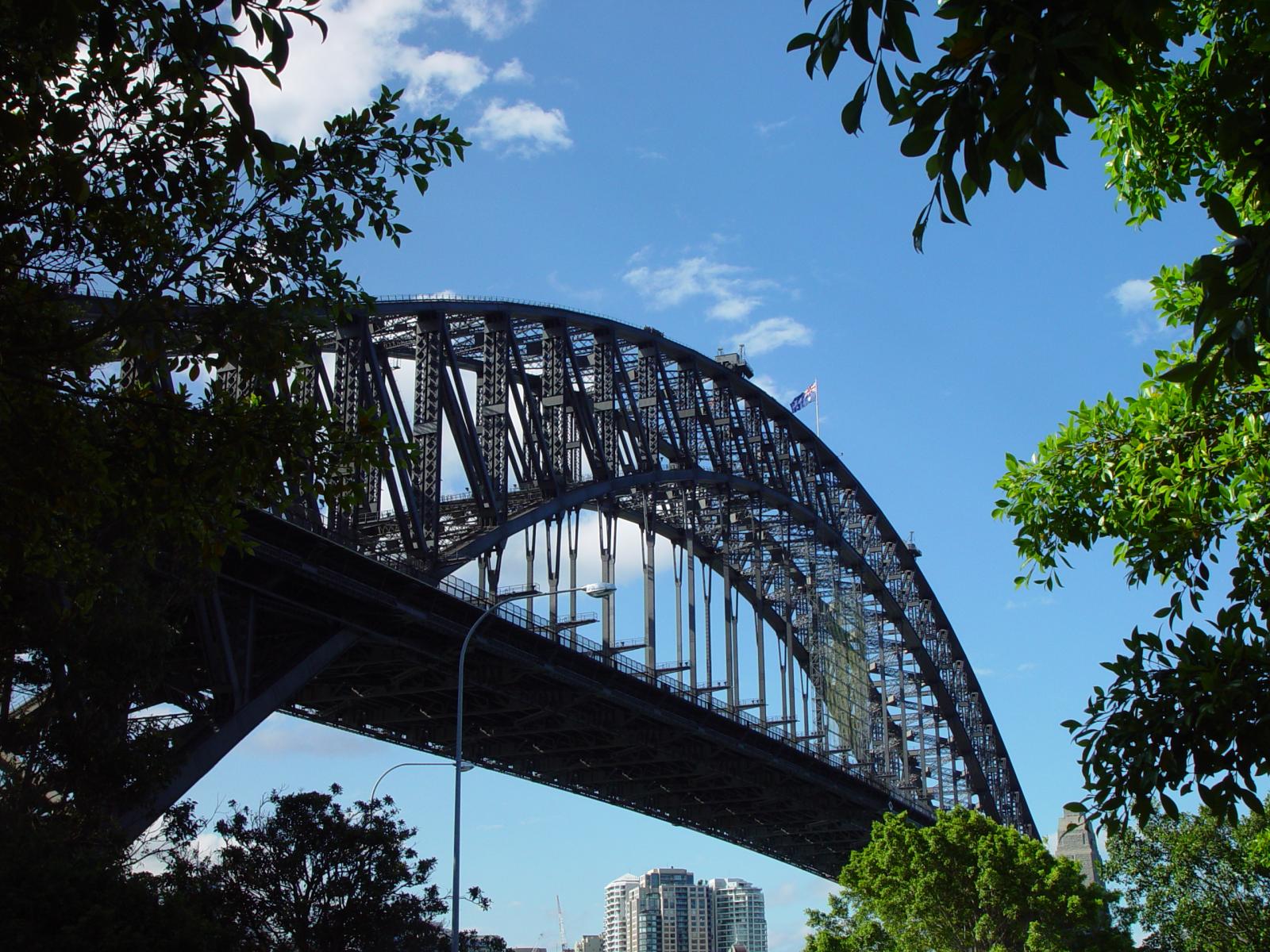
Sydney Harbor Bridge
Bell on wharf in San Francisco
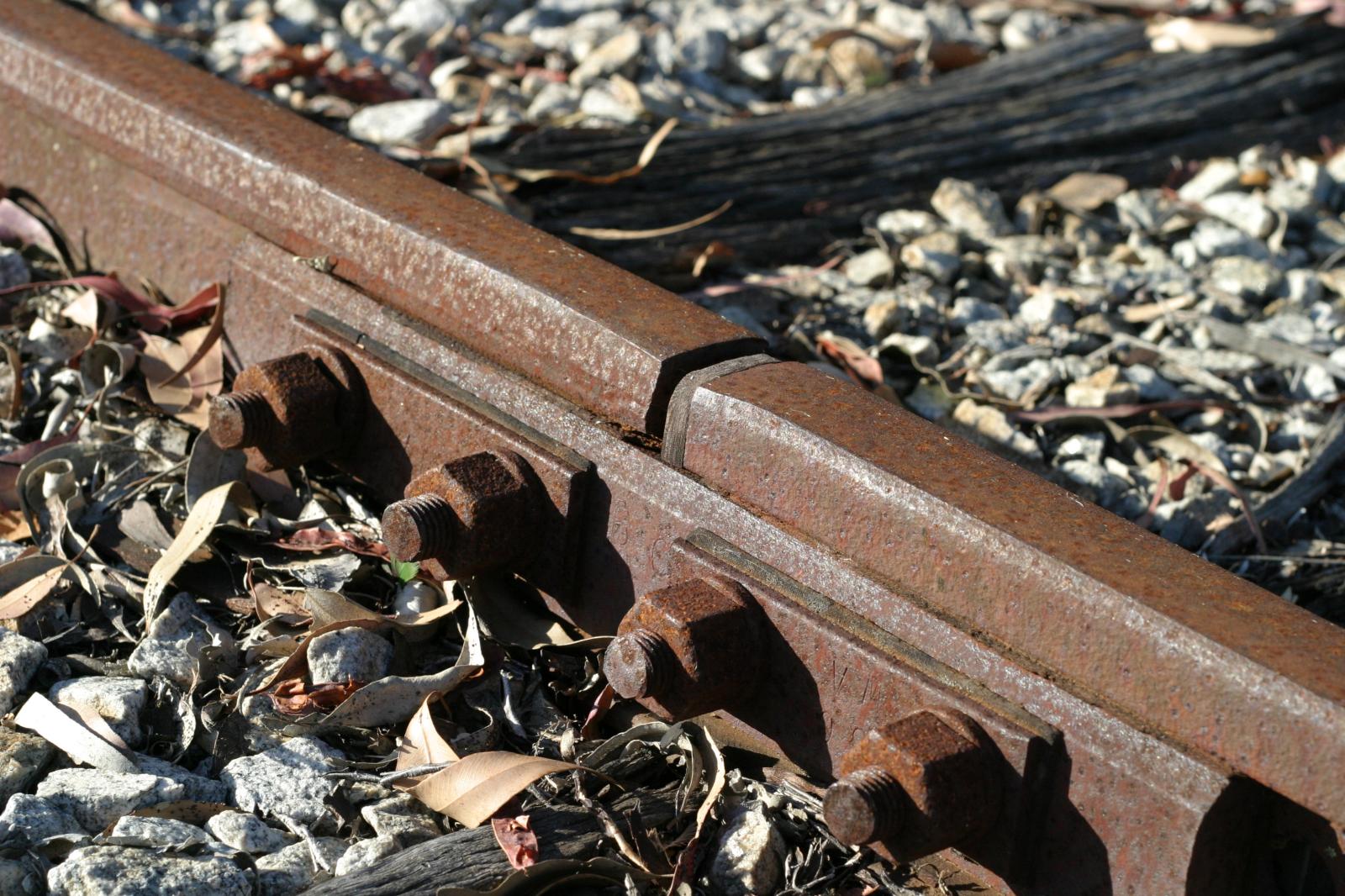
Rusty rails with fishplate, Kojonup
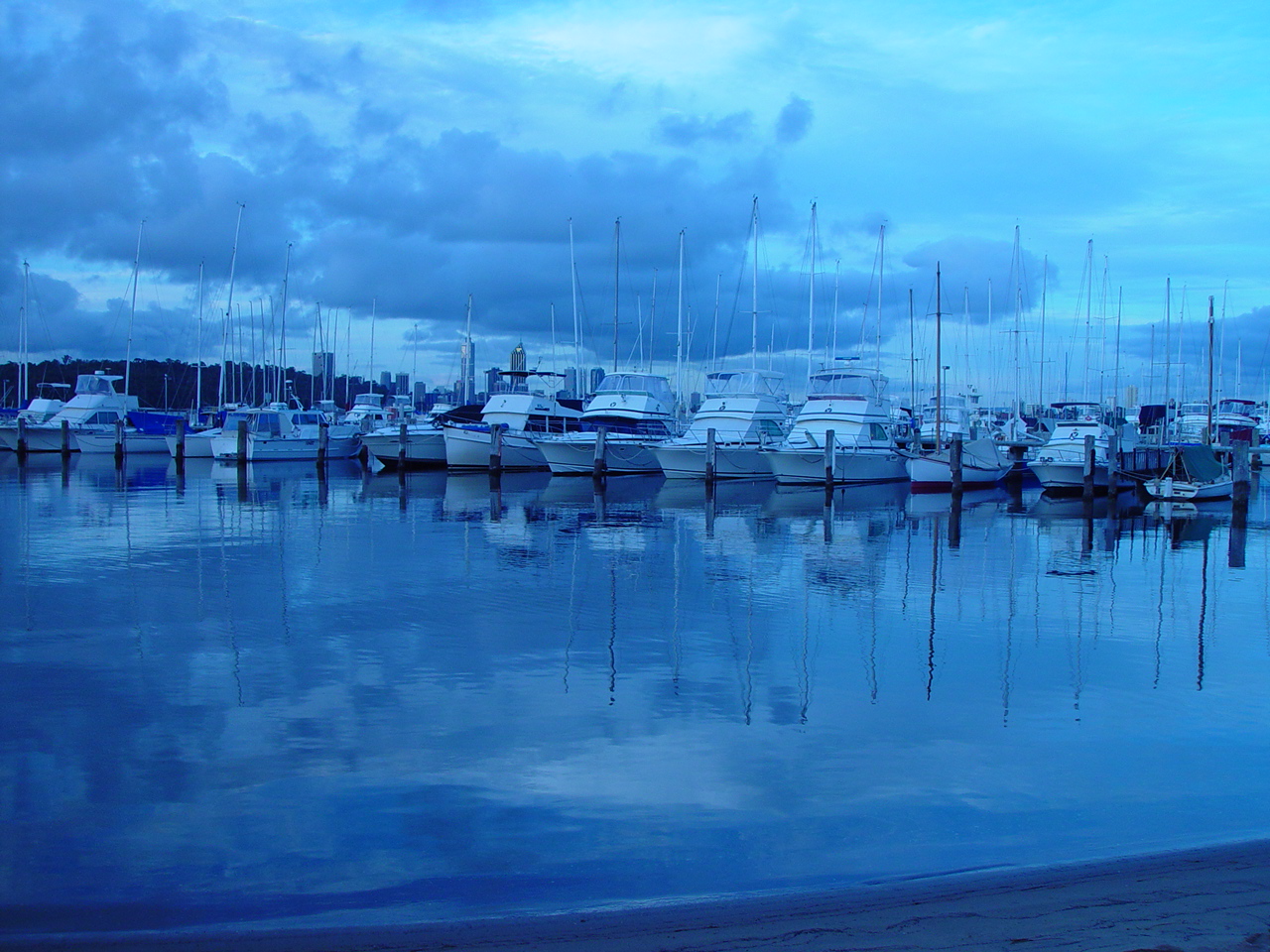
Boats and reflections, Royal Perth Yacht Club
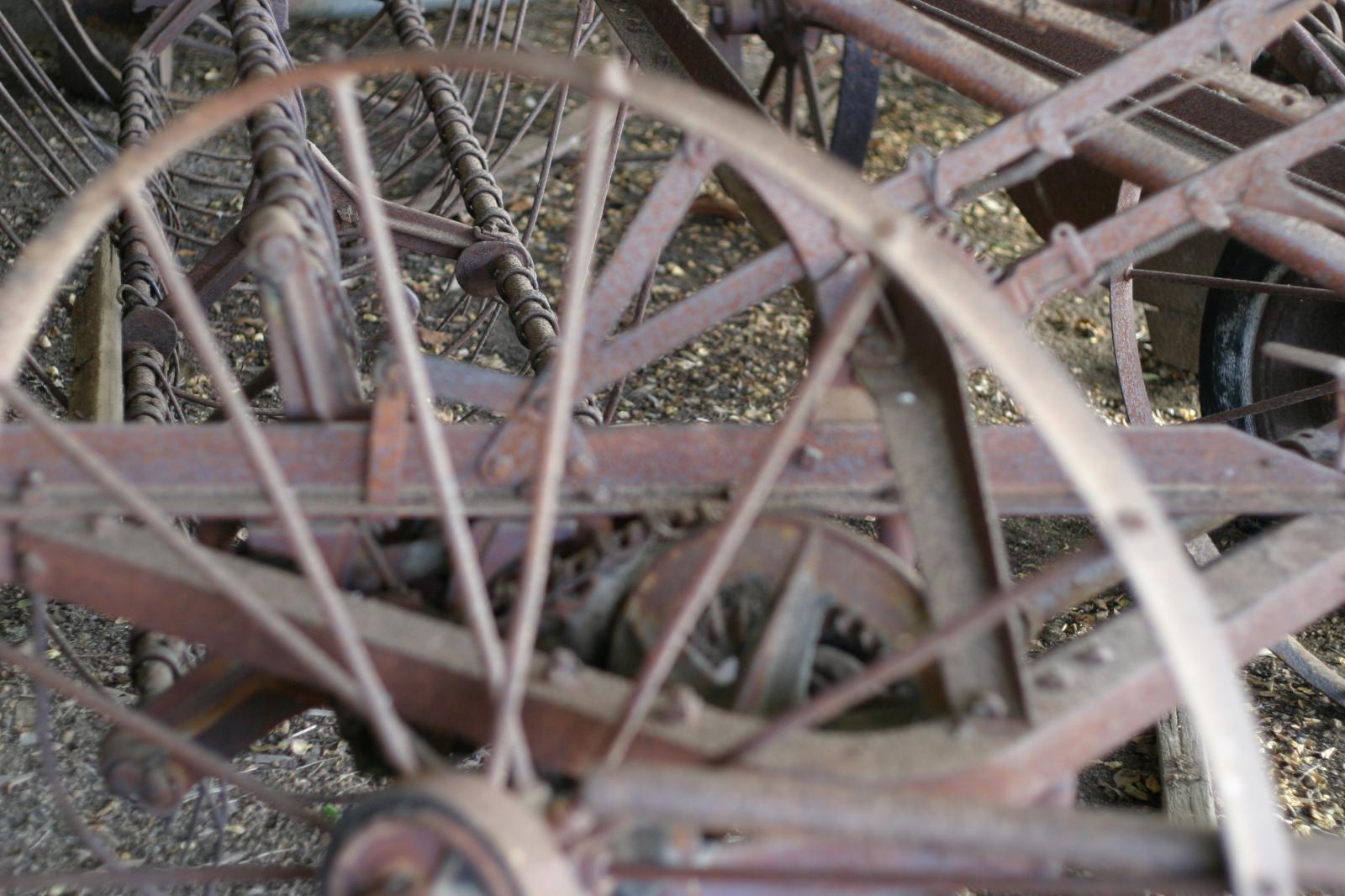
Antique farm machinery, Mount Barker Museum, Western Australia
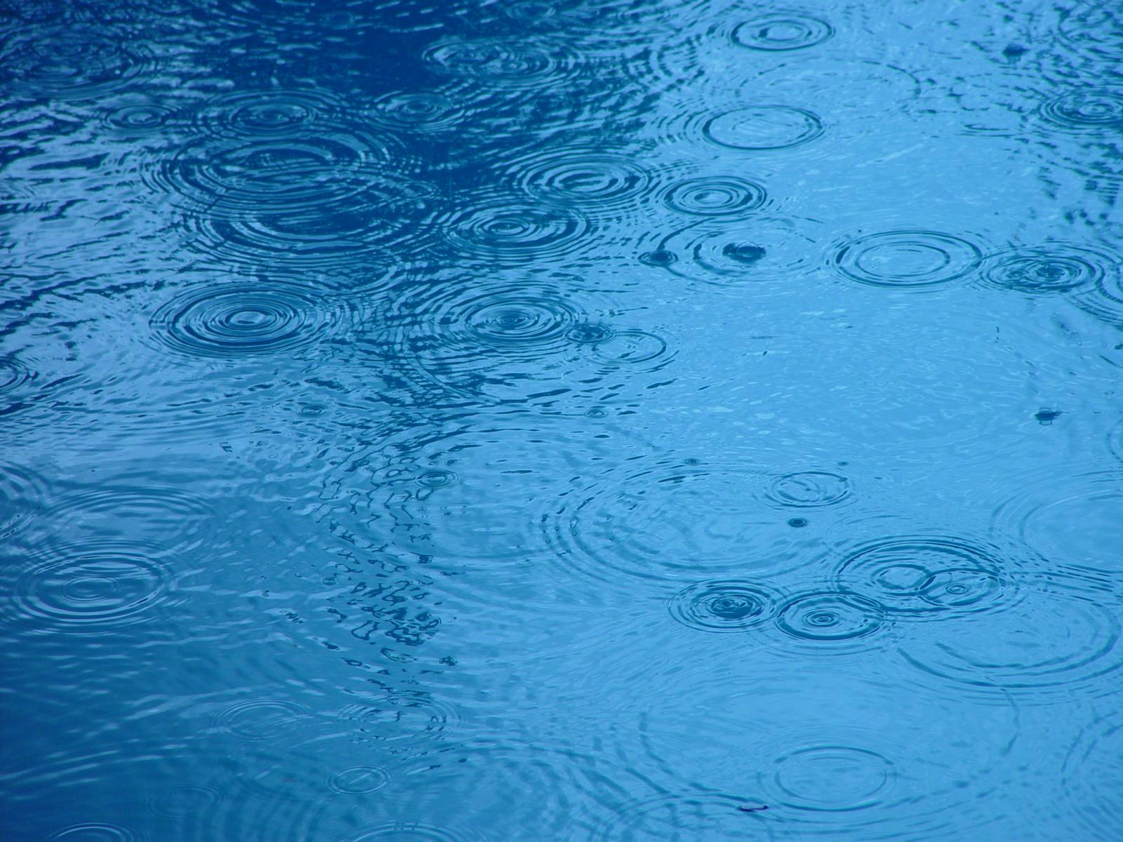
Raindrop ripples on a pond
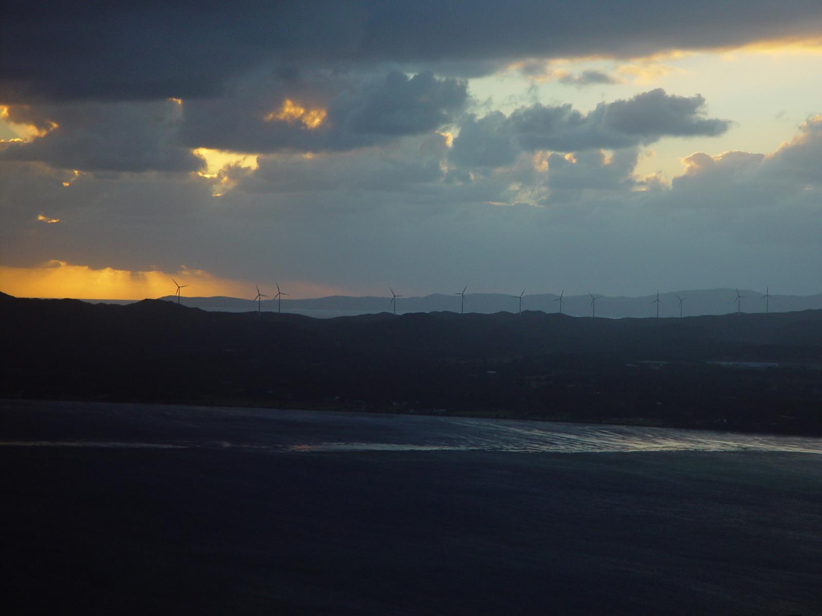
Albany wind-farm against the sunset, Western Australia
Lorem ipsum dolor sit amet, consectetuer adipiscing elit. Donec mollis. Quisque convallis libero in sapien pharetra tincidunt. Aliquam elit ante, malesuada id, tempor eu, gravida id, odio. Maecenas suscipit, risus et eleifend imperdiet, nisi orci ullamcorper massa, et adipiscing orci velit quis magna.
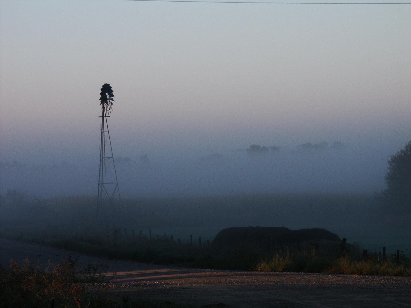
Windmill shrouded in fog at a farm outside of Walker, Iowa
Jericoacoara Ceara Brasil
Sunrise over the coast in Huatulco, Oaxaca, Mexico
Seven columns: how does this look on a narrow window?
It’s dangerous to go alone! Take this.
Boat BW PB Barco Texture Beautiful Fishing
Coastline in Huatulco, Oaxaca, Mexico
Jericoacoara Ceara Brasil
Sunrise over the coast in Huatulco, Oaxaca, Mexico
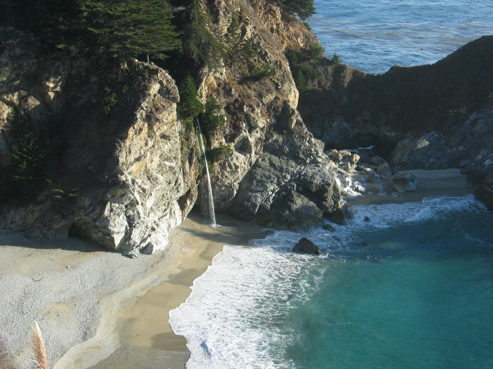
Beach at Big Sur, CA
Windmill shrouded in fog at a farm outside of Walker, Iowa
Sea and rocks, Plimmerton, New Zealand
Rusty rails with fishplate, Kojonup
images linked to media file – do captions obscure links?
Eight columns:
Lorem ipsum dolor sit amet, consectetuer adipiscing elit. Donec mollis. Quisque convallis libero in sapien pharetra tincidunt. Aliquam elit ante, malesuada id, tempor eu, gravida id, odio. Maecenas suscipit, risus et eleifend imperdiet, nisi orci ullamcorper massa, et adipiscing orci velit quis magna.
Boardwalk at Westport, WA
Golden Gate Bridge
Antique farm machinery, Mount Barker Museum, Western Australia
Orange Iris
Albany wind-farm against the sunset, Western Australia
This page tests how the theme displays the columns block. The first block tests a two column block with paragraphs.
This is the second column. It should align next to the first column. Reduce the browser window width to test the responsiveness.
This is the second column block. It has 3 columns.
Paragraph 2 is in the middle.
Paragraph 3 is in the last column.
The third column block has 4 columns. Make sure that all the text is visible and that it is not cut off.
Now the columns are getting narrower.
The margins between the columns should be wide enough,
so that the content of the columns does not run into or overlap each other.
Column one.
Column two.
Column three.
Column four.
Column five.
To change the number of columns, select the column block to open the settings panel. You can show up to 6 columns. If the theme has support for wide align, you can also set the alignments to wide and full width.
Below is a column block with six columns, and no alignment:
Column one.
Column two.
Column three.
Column four.
Column five.
Column six.
Next is a 3 column block, with a wide alignment:
Column one.
Column two.
Column three.
And here is a two column block with full width, and a longer text. Make sure that the text wraps correctly.
This is column one. Sometimes, you may want to use columns to display a larger text, so, lets add some more words. Lorem ipsum dolor sit amet, consectetuer adipiscing elit. Donec mollis. Quisque convallis libero in sapien pharetra tincidunt. Aliquam elit ante, malesuada id, tempor eu, gravida id, odio. Maecenas suscipit, risus et eleifend imperdiet, nisi orci ullamcorper massa, et adipiscing orci velit quis magna. Praesent sit amet ligula id orci venenatis auctor. Phasellus porttitor, metus non tincidunt dapibus, orci pede pretium neque, sit amet adipiscing ipsum lectus et libero. Aenean bibendum. Curabitur mattis quam id urna. Vivamus dui. Donec nonummy lacinia lorem. Cras risus arcu, sodales ac, ultrices ac, mollis quis, justo. Sed a libero. Quisque risus erat, posuere at, tristique non, lacinia quis, eros.
Column two. Cras volutpat, lacus quis semper pharetra, nisi enim dignissim est, et sollicitudin quam ipsum vel mi. Sed commodo urna ac urna. Nullam eu tortor. Curabitur sodales scelerisque magna. Donec ultricies tristique pede. Nullam libero. Nam sollicitudin felis vel metus. Nullam posuere molestie metus. Nullam molestie, nunc id suscipit rhoncus, felis mi vulputate lacus, a ultrices tortor dolor eget augue. Aenean ultricies felis ut turpis. Lorem ipsum dolor sit amet, consectetuer adipiscing elit. Suspendisse placerat tellus ac nulla. Proin adipiscing sem ac risus. Maecenas nisi. Cras semper.
We can also add blocks inside columns:
This is a numbered list,
inside a 3 column block
with a wide alignment.
The middle column has a paragraph with an image block below.
Lorem ipsum dolor sit amet, consectetuer adipiscing elit. Donec mollis. Quisque convallis libero in sapien pharetra tincidunt. Aliquam elit ante, malesuada id, tempor eu, gravida id, odio. Maecenas suscipit, risus et eleifend imperdiet, nisi orci ullamcorper massa, et adipiscing orci velit quis magna.
-This third column has a quote
Theme Reviewer
But wait there is more! We also have a block called Media & Text, which is a two column block that helps you display media and text content next to each other, without having to first setup a column block:
Media & Text
A paragraph block sits ready to be used, below your headline.
Yes, it is a press, certainly, but a press from which shall flow in inexhaustible streams, the most abundant and most marvelous liquor that has ever flowed to relieve the thirst of men!
Johannes Gutenberg
The quote blocks themselves have no alignments but the text can be aligned, bold, italic, and linked:
The Common category includes the following blocks: Paragraph, image, headings, list, gallery, quote, audio, cover, video.
The paragraph block is the default block type. It should not have any alignment of any kind. It should just flow like you would normally expect. Nothing fancy. Just straight up text, free flowing, with love.
This paragraph is left aligned.
This italic paragraph is right aligned.
Neither of these paragraphs care about politics, but this one is bold, medium sized and has a drop cap.
This paragraph is centered.
This paragraph prefers Jazz over Justin Timberlake. It also uses the small font size.
This paragraph has something important to say: It has a large font size, which defaults to 36px.
The huge text size defaults to 46px, but the size can be customized.
This paragraph is colorful, with a red background and white text (maybe). Colored blocks should have a high enough contrast, so that the text is readable.
Below this block, you will see a single image with a circle mask applied.